Louie® Sentry
Don't chase leads. Catch opportunities.
Designing a business opportunity intelligence platform that turns meaningful signals into evidence-backed outreach, with human approval at every step.
Overview
Louie Sentry is the first pilot-ready agent within the Louie Intelligence Network (LIN), a broader ecosystem of specialized intelligence agents.
Sentry identifies emerging business opportunities, researches the signals behind them, evaluates their relevance, and drafts personalized outreach in the user's voice. Rather than automating outreach without oversight, it keeps people in control of every message and decision.
The challenge was to make a complex, multi-step intelligence workflow feel clear, trustworthy, and actionable—from the first discovery to the final approved email.
- Role
- Product Design · UX Strategy · Brand · Marketing Site
- Timeline
- 2026 · Pre-launch
- Platform
- Web application · Marketing website
- Tools & Stack
- Astro · GSAP · Lenis · HTML prototypes
- Scope
- Product experience · UX architecture · Interaction design · Visual identity · Web design
01 — The problem
Deal teams chase lists instead of moments.
Most outreach starts with a bought list: thousands of names with no reason attached. Teams sequence them, burn their sending domains, and accept reply rates around 1% as normal.
The tools on the market reinforce the habit. Some sell the list (Apollo, Clay). Others sell the sending (Instantly, Smartlead, Amplemarket). Almost none help with the step before both: knowing which opportunities are real, why the timing is right, and what evidence supports reaching out.
Sentry had to start from the moment, not the name. A fund raises, a brand begins sponsoring creators, a company expands. The product had to surface those moments, show exactly where each one came from, and then wait for a person to say yes.
The design challenge
How might we help people identify the right opportunities at the right time, understand the evidence behind each recommendation, and prepare relevant outreach without surrendering control?
Three principles guided the experience:
- Proof
- Every discovery connects to its source. Users can understand what happened, why it matters, and how a recommendation was formed.
- Control
- Nothing gets sent without human approval. Research and drafting can be assisted, but the decision to contact someone stays with the user.
- Honest data
- Verified facts, inferred insights, and fictional sample records must be clearly distinguished. The experience should never imply certainty where evidence is missing.
02 — Research & discovery
1. Competitive landscape
I mapped the tools teams already use and what each one optimises for:
- Apollo.io: a contact database with sequences, now adding scheduled AI agents.
- Clay: flexible enrichment and research workflows, powerful but configuration-heavy.
- Instantly and Smartlead: sending infrastructure and automation at volume.
- Amplemarket: AI-led outbound, sold as an "AI SDR".
- Industry specialists, e.g. ConstructConnect and BuildingConnected for bids, and Instrumentl for grants: deep in one vertical only.
2. Auditing the working product
Sentry already existed as a working portal, so I used it end to end as a client would, and logged every point where I slowed down:
- The ask box dominated the screen. It sat at the top, but the link between a goal, the research Sentry ran, and the opportunities it returned was unclear.
- Drafting was one long stacked form. Reviewing two or three versions of an email meant endless scrolling.
- Compare squeezed three forms into narrow columns. The information was all there, but it couldn't be scanned.
- Clients had nowhere to see results. Everything lived inside the operator's tool. There was no view of what was found, qualified, approved, sent and answered.
3. Stakeholders and reviews
I worked with the product owner on every major decision, and brought security, threat and backend reviewers in at each build stage. Their findings changed the design, not just the code:
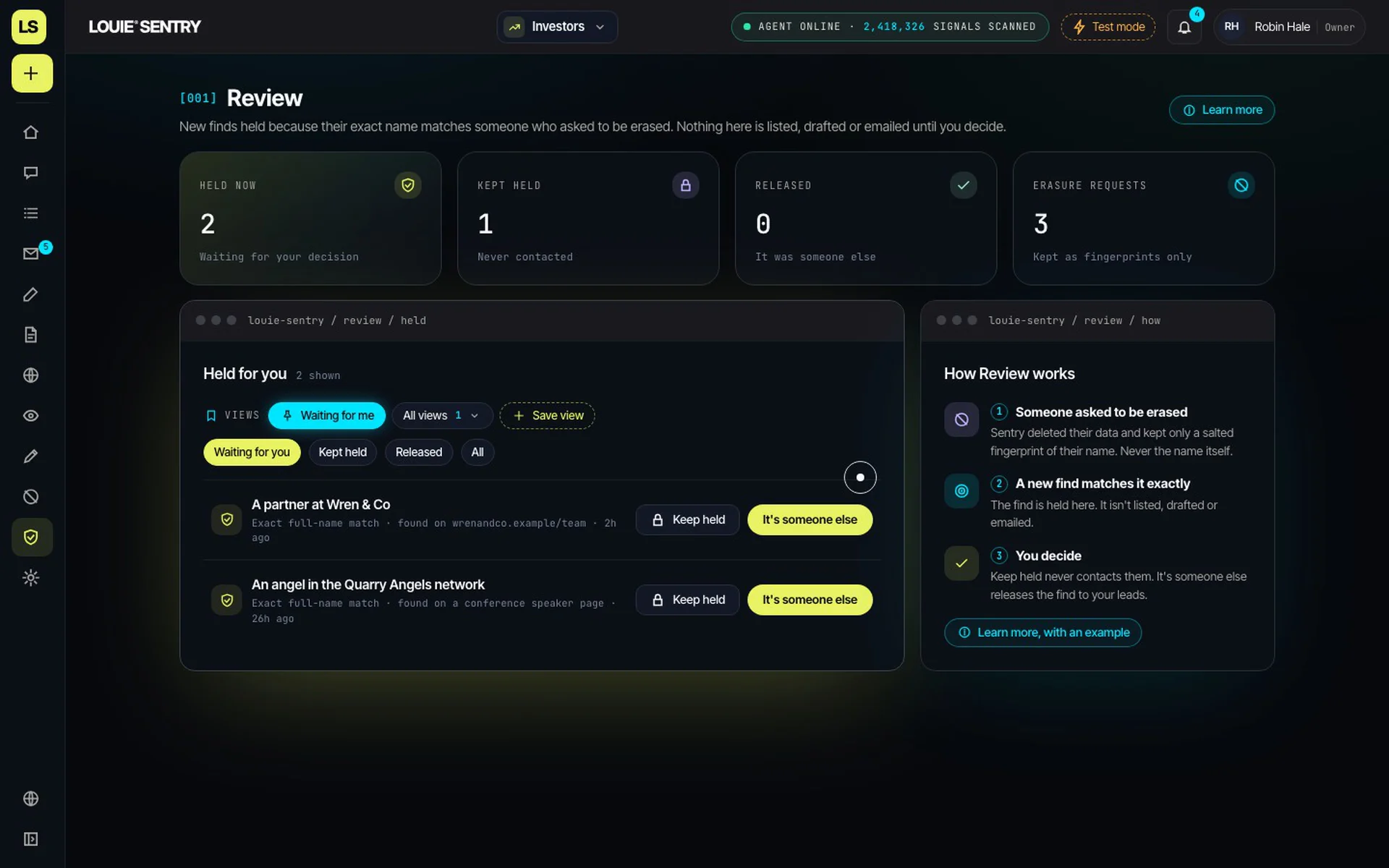
- Erasure had to hold for good. If someone asks to be deleted, Sentry can't simply forget them; it might find them again. That review produced the Review page: an exact-name match to an erased person is held for a human decision, and only a salted fingerprint is ever stored.
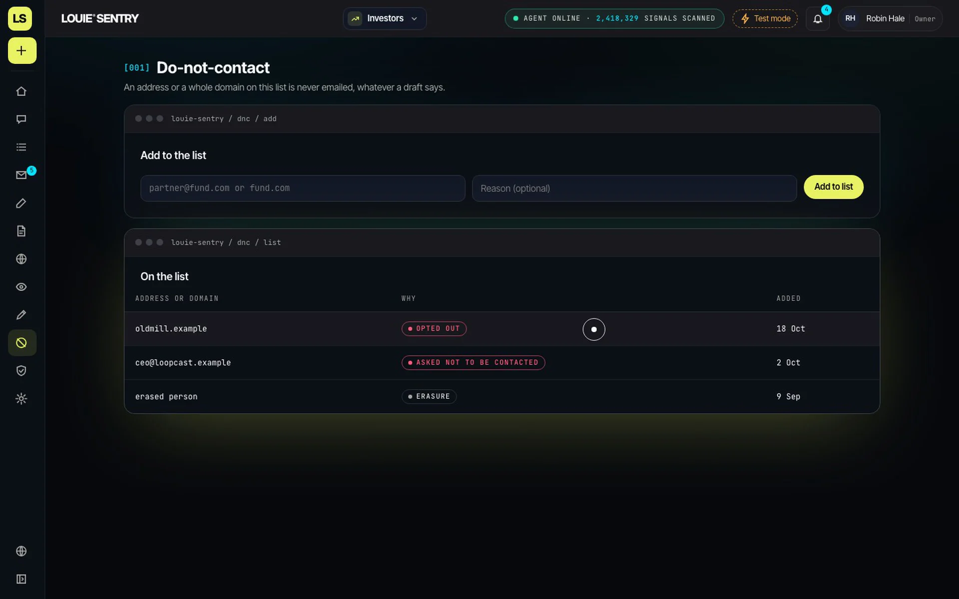
- Opt-outs had to work across every workspace. A person who opts out of investor outreach can't reappear in brand outreach. Suppression became account-wide and visible in the interface.
- LinkedIn stays human. After reviewing LinkedIn's terms, we kept LinkedIn as draft-only: Sentry writes it, and the user sends it from their own account.
- The public assistant had to be grounded. Ask Louie on the website answers only from approved content, and refuses rather than invents prices, customers or features.
4. Pushback and iteration
Not every direction survived contact with the team:
- Colour. The first palette leaned on a signature yellow. In review it read as cheap and off-brand, so we moved to the EchoSync system: lime for actions, cyan for data, on pure black.
- Too static. Early dashboards were accurate but felt dead and monochrome. The direction shifted to a product that feels alive: live counters, streaming run logs, clickable KPI tiles and motion on every state change.
- Typography. A serif-italic accent tested as decorative rather than confident. It became a bold sans system: Supreme for headlines, Inter Tight for text and JetBrains Mono for data labels.
- Automation versus control. There was pressure to let Sentry send on its own. We held the line: Sentry prepares everything, and a person approves every send. Test mode routes approved emails to the user first.
- The line. "Don't chase lists" became "Don't chase leads. Catch opportunities.", so the promise reads as one thought.
Design opportunity
Sentry didn't need more features. It needed one coherent path through discovery, evidence, qualification, writing, approval and results, where every recommendation is traceable and every action intentional.

03 — Key design decisions
01. Evidence over invention
A recommendation is only useful when the user can understand why it exists.
I designed the experience around source-backed discoveries, visible supporting evidence, and explainable fit scores. Rather than presenting a score as an unquestionable verdict, the interface should help users understand what strengthens or weakens a match.
Design principle: Show the reasoning behind the recommendation, not just the result.
02. Human approval at every send
Automation should reduce repetitive work without removing meaningful decisions.
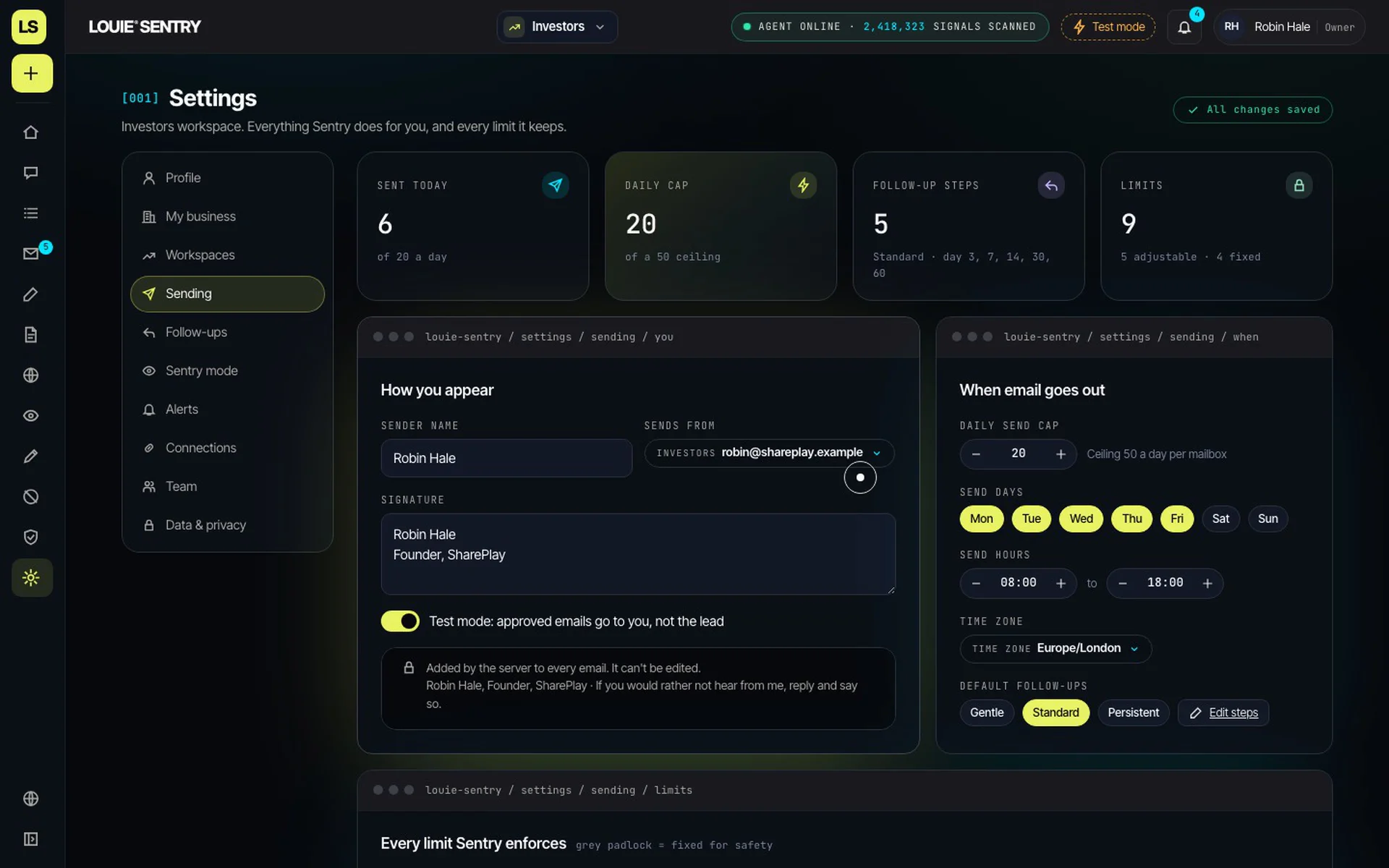
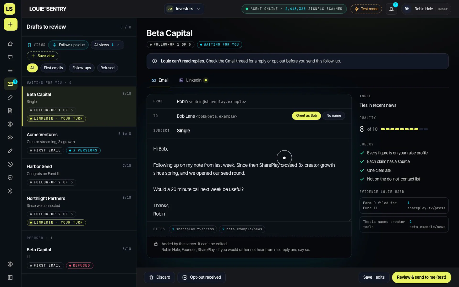
Sentry prepares research and outreach drafts, but every first email and follow-up waits for approval. Test mode provides an additional review step by routing approved messages to the user's inbox before live sending is enabled.
The writing experience also needs to make revisions clear, helping users understand what changed before approving a message.
Design principle: Automate the preparation. Keep the decision human.
03. Privacy and consent across the workflow
Trust cannot stop at the first email.
Opt-outs need to apply across workspaces, hard bounces must not be retried, and erasure requests must be respected. The product should also avoid presenting restricted platform data as an available source.
LinkedIn outreach, for example, remains draft-only: users review the prepared message and send it from their own account.
Design principle: Build safeguards into the workflow, not just the settings.
04. Results that clients can understand
The value of an intelligence platform should be visible beyond the person operating it.
I defined a dedicated client results dashboard to make the workflow measurable, from discovery through qualification, approval, sending, replies, and meetings. Opens are excluded from success reporting so that attention metrics are not confused with meaningful outcomes.
Design principle: Measure progress toward business outcomes, not vanity metrics.

04 — The platform
From discovery to action
Home surfaces what Sentry has found since the user's last visit, with outreach drafts ready for review.
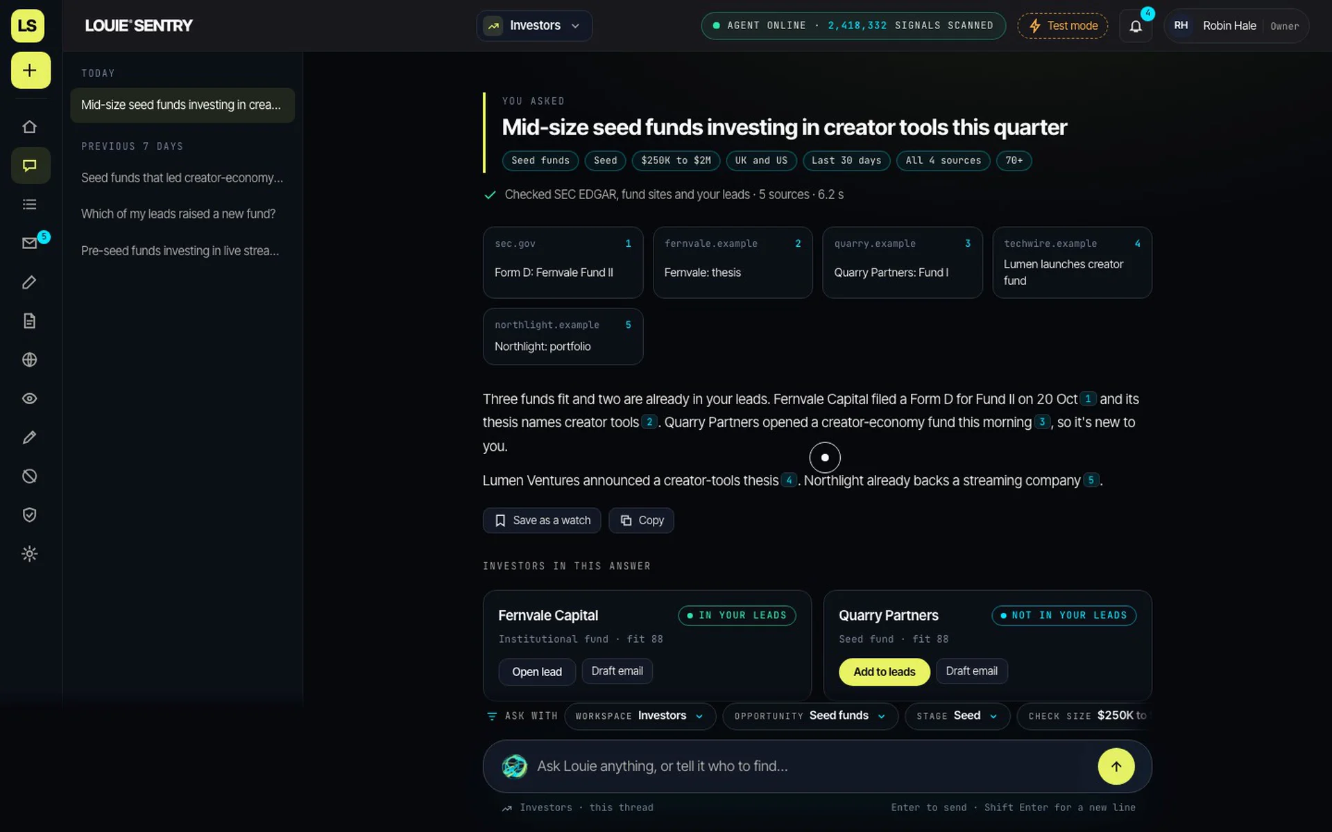
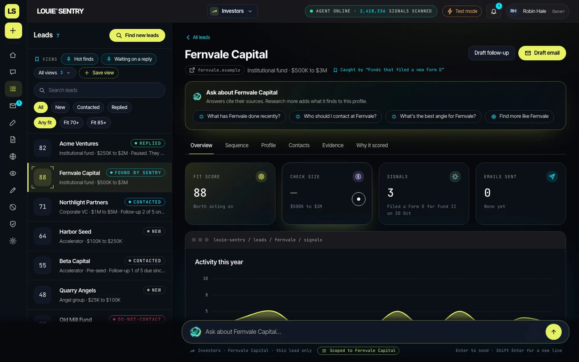
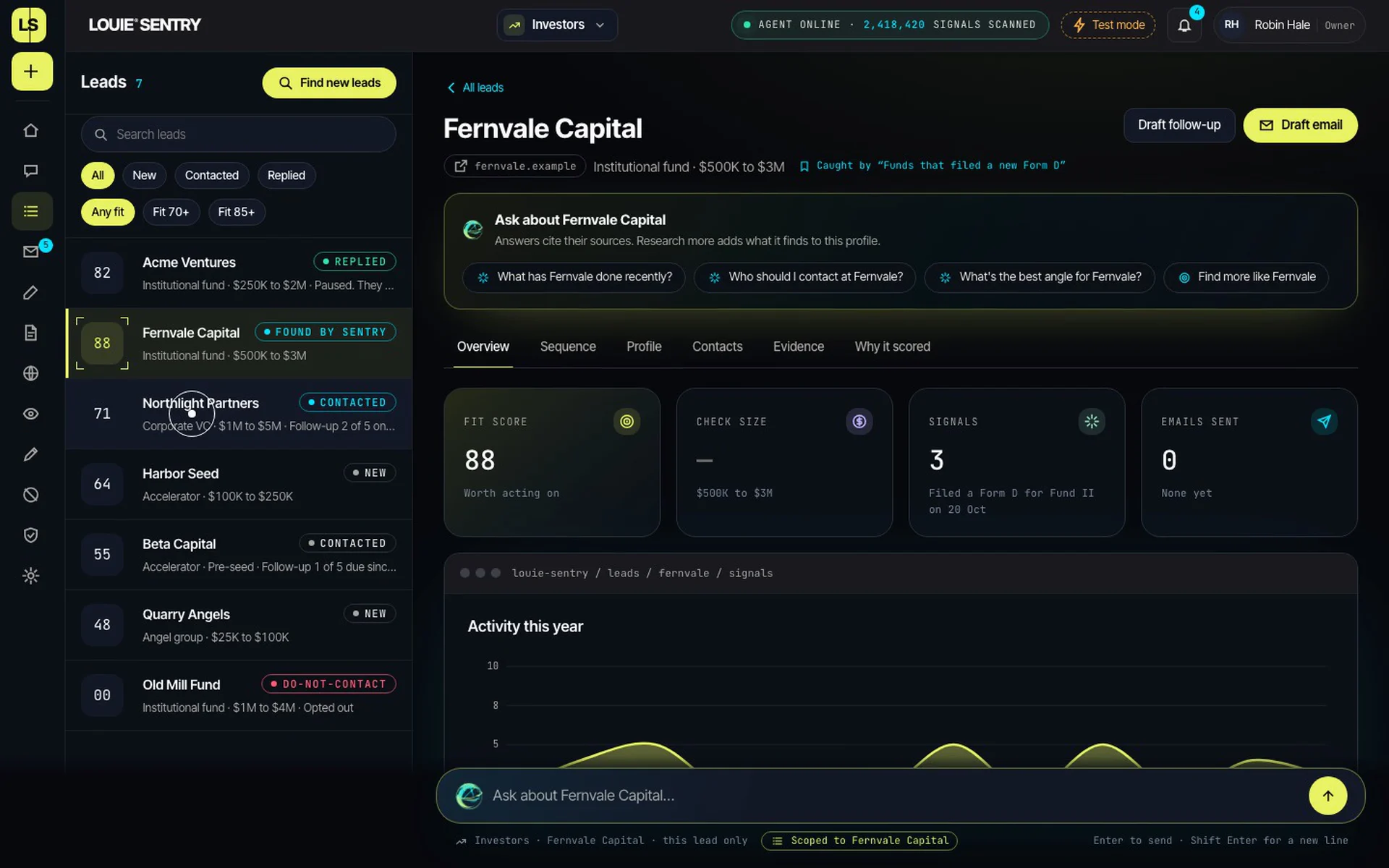
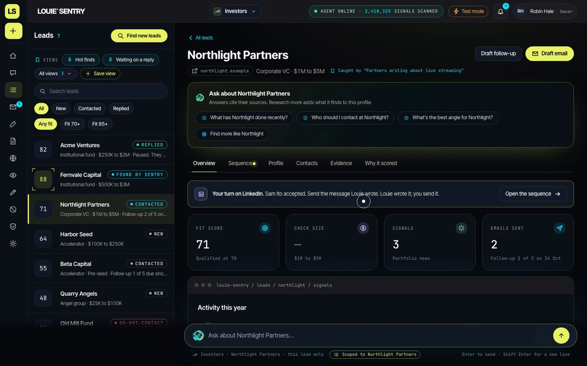
Each lead has its own Ask interface, bringing recent activity, relevant contacts, recommended outreach angles, and deeper cited research into one place. Research More adds supporting evidence directly to the profile.
Sentry mode monitors saved watches on a schedule, within user-defined limits, and records each step as it works.
05 — Measuring results
Visibility beyond the workflow
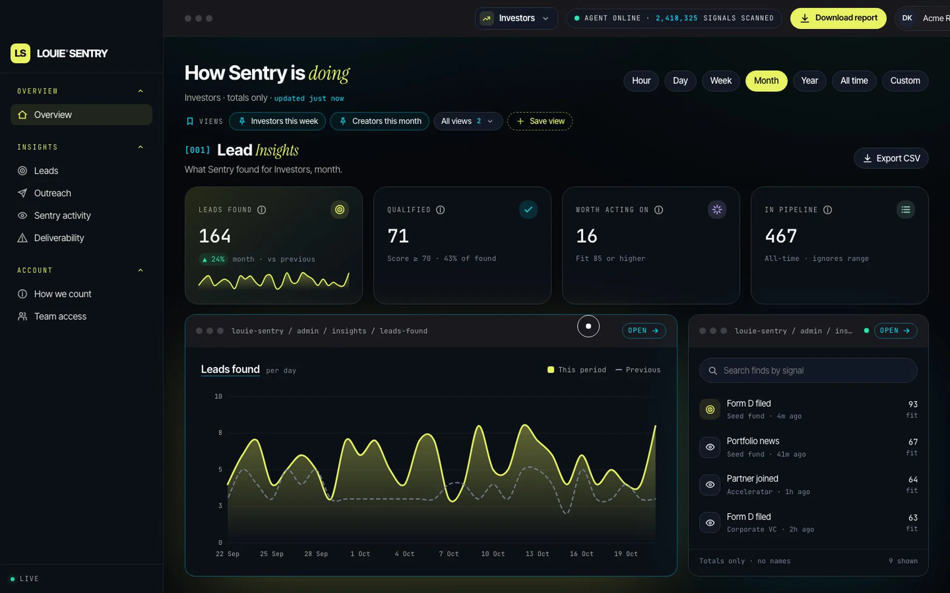
Insights gives each client a dedicated dashboard to track performance across the pipeline: leads found, qualified, worth acting on, emails sent, replies, and progression from discovery to meeting.
Time saved is presented as a clearly labelled estimate, not a measured outcome. Opens are excluded as a measure of intent, keeping reporting focused on meaningful actions rather than vanity metrics.
06 — The solution
One connected workflow, from signal to outcome
Sentry brings opportunity discovery, research, qualification, outreach preparation, and follow-through into one connected experience.
- 01
Discover
Identify changes, announcements, and other meaningful signals that may create an opportunity.
- 02
Research
Build a contextual profile using available sources, relevant contacts, verified details, and potential reasons to reach out.
- 03
Qualify
Evaluate how well an opportunity matches the user's criteria, with supporting evidence and transparent reasoning.
- 04
Write
Generate personalized outreach in the user's preferred voice, with different angles to review and refine.
- 05
Approve
Review every message before sending, with test mode available to validate the workflow safely.
- 06
Track
Follow progress from discovery to replies and meetings, with a dedicated results view for clients.
The result is a workflow designed to replace fragmented prospecting tasks with a more focused, evidence-led process.
07 — Designing for trust
Trust is a product behavior.
For Sentry, trust needed to be expressed through the interface and enforced through the underlying workflow.
That meant making the source of each discovery visible, distinguishing verified information from inference, explaining fit scores, and ensuring that sending remained an explicit user decision.
It also meant designing for what should not happen: no unapproved sends, no retrying hard bounces, no outreach after an opt-out, and no unsupported claims presented as facts.
These constraints shaped the experience as much as the core discovery features.
08 — The outcome
From a working portal to a product experience with a clear point of view
The design direction brings Sentry's core promise into focus: discover meaningful opportunities, understand the evidence, and act with intention.
The experience is structured around a clear progression from signal to outcome, with dedicated attention to research, comparison, approval, and client visibility.
As the first pilot-ready agent within the Louie Intelligence Network, Sentry also establishes a foundation for a broader family of specialized agents—each designed for a different purpose, while sharing the same principles of evidence, transparency, and human control.
Mobile
Reflection
The central design challenge wasn't how to automate more of prospecting. It was how to make intelligence useful without making it opaque.
When a product influences who gets contacted, what gets communicated, and which opportunities receive attention, the reasoning matters as much as the recommendation.
Sentry's design direction is built around that belief: less time chasing lists, more clarity around the opportunities worth pursuing.